
Studies Dashlet
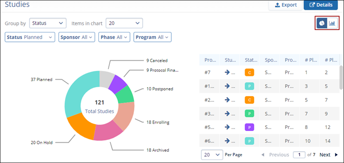
The Studies dashlet provides a visual and detailed overview of the study portfolio. It features a customizable chart, either pie or bar, alongside a study list displayed in a clear table format, offering both high-level insights and granular data.
Users can interact with the dashlet in the following ways:
- Toggle Chart Type: Click the Pie or Bar Chart icons to switch between visualization styles based on the preferences.
- Group and Display: Click on Group by to select the preferred grouping criteria (e.g., by status, phase, sponsor, or program). The chart will automatically update based on the selected grouping. Users can also click on the number of items to control how many categories are displayed in the chart.
- Apply Filters: Use the available filters to further refine the data shown in the chart and table, ensuring the view reflects exactly what is needed.
This combination of visual summaries and detailed listings helps users analyze study distribution and quickly drill into areas of interest.
A user can perform the following actions on this dashlet.
- Click on the Pie or Bar
Chart icons to choose between different types of
charts for data visualization.
- Click on Group by and select the required
grouping criteria from the available options. The pie chart details
will be populated as per the selected grouping criteria. Click on
the number of Items in the chart to select the
number of items to display in the chart. In the image below, the
pie chart shows the total number of studies bifurcated by the
Status.
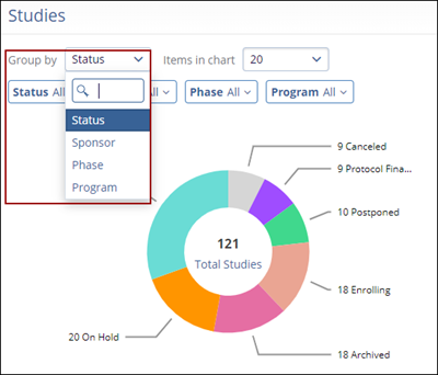
- Select and apply the filters to customize the pie chart.
- Status
- Sponsor
- Phase
-
Program
- In the table, click on the Up and
Down arrows to sort the data in ascending or
descending order respectively.
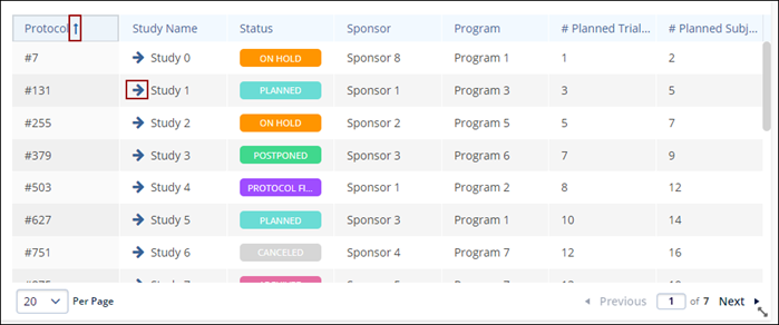
- Additionally, click on the arrow pinned to the study name to open the Study details page.
- Click on the Details button to open the modal view of the Studies and perform the similar functions as listed above.
- Additionally click on Export on the Regular and Modal view to retrieve an export of the Studies data.
Note:
- The columns and details in the Study export files are different but the export process is similar to Exporting Contacts.
- The process for exporting Portfolio charts is similar across all dashlets.